
Color blind people make up a significant portion of the population – about 1 in 12 men and 1 in 200 women to be exact. Yet, color blind users are an often overlooked audience in UI design.
Many mistake color blindness for seeing in black and white, and while this is one type, there are less rare and less extreme versions.
Most people are trichromatic, meaning that they perceive color as a combination of three colors: green, red, and blue. Different types of color blindness or color vision deficiency (CVD) come from being unable to perceive one or more of these colors clearly. The most common CVD types are red-green color blindness, where it’s hard to distinguish between red and green, and red color blindness, where red colors appear dull.
We believe that everyone should have fair and equal access to the internet, so it is essential that UI designers design with color blind users in mind. The Americans with Disabilities Act (ADA) even requires certain organizations to meet WCAG 2.0 Level AA guidelines.
Making your website ADA compliant isn’t difficult, but it does mean considering color accessibility. Outside of legal ramifications, designing for color blind users is vital to the user experience you offer.
Why Designing for Color Blindness Matters
Color theory plays a large role in UI design because color has the power to influence a user’s purchase decisions, emotional response, and overall user experience. Think about how important choosing the right brand colors is for a business. Now imagine that over 8% of people can’t read your logo or website because of the colors you chose. That’s a lot of lost opportunity.
Since color blind users cannot tell certain colors apart, designers can’t rely on color alone for the readability or emotional impact of a design. When you use color, you need to consider how users interact with it and create an interactive design that appeals to the target audience – color blind members included. It’s a designer’s job to be empathetic to user pain points so they can prevent and solve them.
Nowadays, there are tools like Visolve that can adjust computer displays for certain types of color blindness, but not all color blind individuals use these tools – not even all color blind people know that they’re color blind.
It’s important to note that your website isn’t the only place to consider color accessibility. Even your social media can be made accessible to the blind and visually impaired.
Color Terminology to Know
Before we get into UI design best practices for color blind users, it’s good to review the fundamentals of color for those who aren’t design experts. There are four main components to consider when choosing a color scheme:
Hue: This is a synonym for ‘color’ and is determined by a color’s spectral wavelength.
Saturation: Also called chroma, this is how intense or pure a color is, determined by the amount of gray present. The less gray there is, the brighter a color appears.
Lightness: Lightness is dependent on the amount of white or black added to a color, creating tints and shades, respectively.
Temperature: This is how warm or cool you perceive a color to be. A computer monitor can affect the perceived temperature of a color.
How to Design for Color Blind Users
Designing for color blindness doesn’t mean making your product less attractive; it merely means following certain best practices during the design process. Implementing good UX and UI design principles will only improve your website’s usability in the long run.
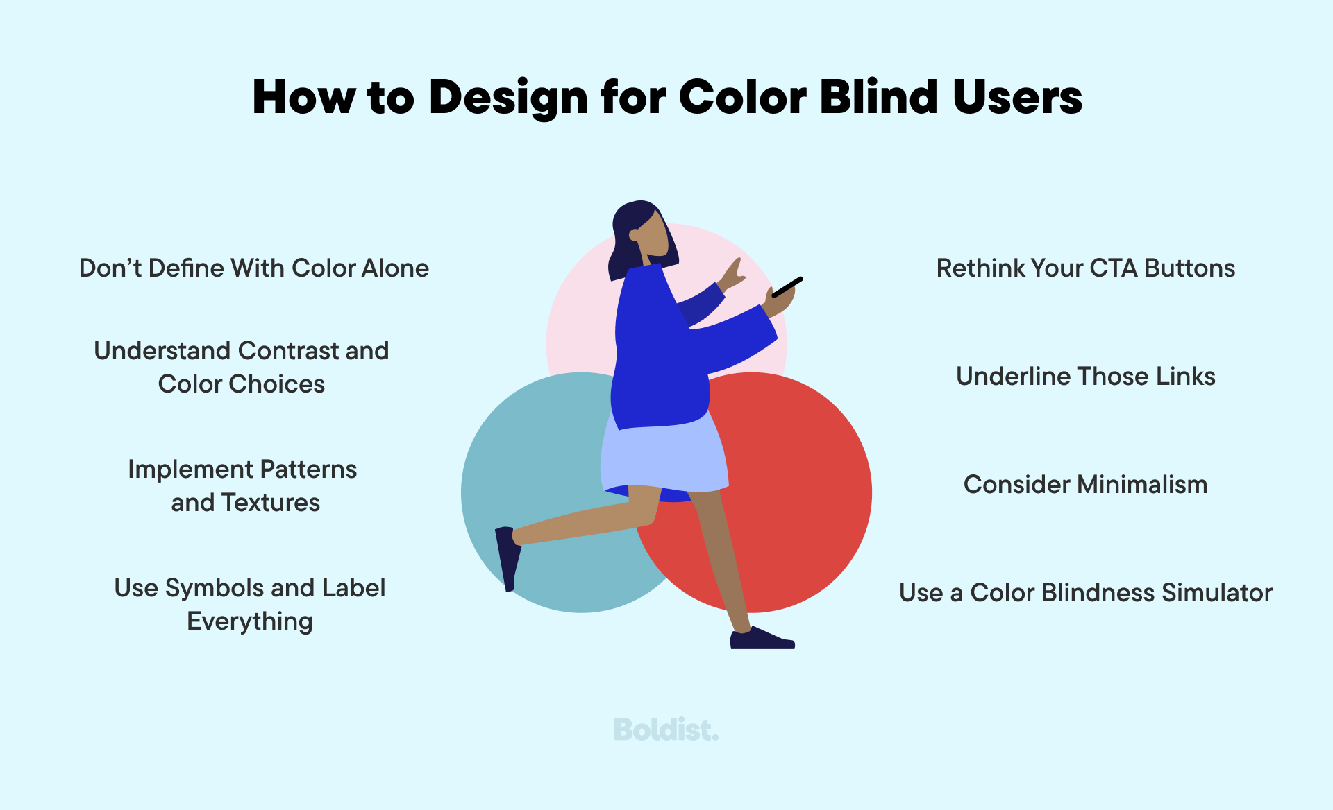
Don’t Define With Color Alone
When designing for color blind users, you can’t rely exclusively on color for any message.
Doing so is a common mistake in data visualization as graphs, charts, and maps are frequently color-coded. Booking forms that show available appointment slots or available concert seating via color coding is also common. Other examples include signifying required or missed form fields by outlining them in color or indicating errors with color.
You should stray away from conveying critical information in colored text and images or at least provide that information in other accessible ways.
Understand Contrast and Color Choices
For color blind users, the contrast between colors is often more important than the color itself. Focusing on contrast is beneficial to designers since the different types of color blindness make merely avoiding a particular color inefficient. To improve the contrast ratio in a color blind friendly palette, lighten your light colors and darken the dark ones.
Here are a few other ways to improve your design’s visibility:
- Emphasize the difference between your foreground and background color
- Don’t choose hues next to each other on the color wheel unless there’s a large difference in lightness
- Avoid using colors of similar lightness, regardless of hue or saturation
- Increase the saturation of hues in use
With that in mind, there are still color combinations that may be more challenging for different types of color blind users. Your color blind friendly palette should stray away from these color combinations when the contrast ratio isn’t significant:
- Red and green
- Green and blue
- Green and brown
- Green and gray
- Green and black
- Blue and gray
- Blue and purple
- Yellow and light green
Implement Patterns and Textures
One way to update your visual designs for color blind users without relying on color palette alone is to use patterns and textures. This works well in instances where color usually helps distinguish information, such as in a graph or chart. Adding pattern or texture elements will help elements stand apart.
Use Symbols and Label Everything
Clear labeling is a best practice for directing any user through the customer journey, including those who are color blind. Labels can help distinguish information typically conveyed with color. This goes for data visualization, such as graphs, or for guiding users on a webpage. Ask yourself if a user can find their way without the color hints you’ve provided.
From an ecommerce standpoint, you should also label your products with clear, descriptive information. Don’t rely on product photos to tell the whole story; label a product’s color.
Rethink Your CTA Buttons
The call-to-action (CTA) is an integral part of interactive design. If a user can’t find it or doesn’t understand it, they won’t progress in the journey, and you won’t meet goals. You need to draw attention to your CTA, and many designers rely on color to do so.
Good UI design implements color but uses one or more of these other standout techniques for CTA buttons as well:
- Size
- Placement
- Heavy contrast
- Weighted borders
- Weighted fonts
- Symbolic icons
- Hover effects
These techniques work on color blind and non-color blind users alike, and you can use them for other page elements you want to draw attention to.
Underline Those Links
If you read any blog, this one included, you’ll notice that links are highlighted to notify users of their presence. The most common way to emphasize a link is with color. For this, use blue because most people with a color vision deficiency can see it.
It’s for users with achromatopsia or monochromacy, though rarer forms of color blindness, that color emphasis won’t be enough. For these people, colored links appear grayed out and are indistinguishable from other text. You can quickly solve this by underlining your anchor text.
Consider Minimalism
Minimalism is far from new. The aesthetic has been trending for decades, making its way through architecture, art, interior decorating, and of course, design.
And now, minimalism has a role in color accessibility because the fewer colors there are, the less chance there is for confusion. It’s also stylistically appealing and less distracting, making it a solid choice for all audiences.
You’re not required to adhere to a minimalist design to be accessible, but it’s one route that works.
Use a Color Blindness Simulator
As the design community works towards an accessible user experience, many great tools have emerged to help. Color blind simulators, for example, allow designers to see their designs the way a color blind user would. One such simulator, Oracle, is available for Mac, Windows, and Linux. Use a color blind simulator to test your work throughout the design process and understand how users interact with your choices.
When deciding on your color palette in the beginning stages, we suggest using a color picker tool that evaluates your choices according to AA guidelines. This contrast checker can tell you your contrast ratio, and this accessible color generator suggests color combinations that work better.
Make Your Website Accessible
Designing for color blindness ensures that your website provides a user experience your entire audience can navigate and enjoy. For them, it means a brand they can rely on; for you, it means successful conversions. Depending on the size of your company, it may also mean following the law. Regardless, it’s part of building a fair and equal online environment.
Color accessibility is just one element of building a welcoming website. Be sure to check our guide on making your content accessible to the deaf and HOH community.